
The Kano Model: Prioritize Features by Customer Delight
Run a RICE scoring model on your backlog and you’ll get a ranked list, but you won’t get an answer to a different, more useful question: which of these features will make customers feel something, and which will just quietly satisfy an expectation they already had? Teams routinely RICE-score their way to a roadmap full of solid, competent features and then wonder why the product still feels forgettable. The Kano model is the framework built to answer that question, and it’s the one most prioritization write-ups skip entirely.
Developed by Noriaki Kano, a Japanese quality-management researcher, in 1984, this framework sorts features into categories based on how they affect customer satisfaction: not how much effort they take or how many people will use them. That distinction matters more than it sounds. A feature can be high-reach, low-effort, and still contribute almost nothing to how much customers love your product. The Kano model is built specifically to catch that.
What the Kano Model Actually Measures
Most prioritization frameworks answer “what should we build next,” ranked by some combination of value and cost. The Kano model answers a narrower question: “what does fulfilling this requirement actually do to satisfaction?” It maps every feature onto one of two axes — how well-implemented it is, and how satisfied or dissatisfied customers are as a result — and the shape of that relationship is different for different kinds of features.
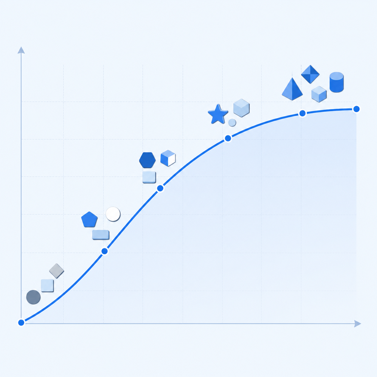
Some features follow a flat, asymmetric curve: missing entirely, they tank satisfaction, but adding more of them barely moves the needle upward. Others follow a straight, linear curve: more is simply better, in direct proportion. And a small third group follows an exponential curve: absent, they cost you nothing, but present, even in small amounts, they produce disproportionate delight. Those three shapes are the heart of the framework, and they’re the reason a backlog ranked purely by RICE score can still ship a product nobody’s excited about. RICE treats all “high value” features as interchangeable, and Kano insists they aren’t.
The Five Categories: Basic, Performance, Delight, Indifferent, Reverse
The Kano model classifies every feature or requirement into one of five buckets:
- Basic (Must-be) attributes — expected by default. Customers won’t praise you for having them, but they will leave, loudly, if you don’t. A password reset flow, a working checkout page, uptime above some baseline.
- Performance (One-dimensional) attributes — satisfaction scales linearly with how well you deliver them. Storage limits, sync speed, battery life. More is better, in a straight line, and this is where most competitive comparisons happen.
- Delight (Attractive/Excitement) attributes — unexpected, and disproportionately satisfying when present. Customers don’t ask for these because they don’t know to ask; a well-timed surprise refund, an unexpectedly good default template, a feature that solves a problem the user hadn’t articulated yet.
- Indifferent attributes — customers genuinely don’t care either way. Common in internal-facing settings pages or admin toggles nobody but power users touches.
- Reverse attributes — the rare case where adding a feature actively reduces satisfaction for a segment of your users, usually because it adds friction or complexity a simpler-minded customer segment doesn’t want.
The category that gets confused most often is delight versus performance. Teams will describe an “AI-powered smart suggestion” feature as a delighter, build it, and then get lukewarm feedback: because customers have started expecting AI suggestions as table stakes, which means the feature has already migrated from delight territory into performance territory before it even shipped. That migration is real and it’s fast: what excited users in 2022 is often just expected by 2026. The airbag is the textbook example outside software — a genuine excitement attribute when Mercedes-Benz introduced it, a performance attribute once competitors added it, and now a threshold attribute standard on the cheapest car on the lot.
Running a Kano Survey Without Overcomplicating It
The classic Kano method uses a paired survey question for each feature: a functional question (“how would you feel if the product had X?”) and a dysfunctional question (“how would you feel if the product did NOT have X?”), each answered on a five-point scale from “I like it” to “I dislike it.” Cross-referencing the two answers for each respondent tells you which category that feature falls into for that person, and aggregating across respondents tells you the dominant category for the feature overall.
Picture a 35-person fintech startup evaluating twelve candidate features for their Q3 roadmap. The biggest mistake teams often make here is surveying too many features at once. Respondents start satisficing — picking the middle option repeatedly — once past roughly fifteen paired questions, and the data gets noisier exactly where it needs to be clean. Cutting the list to the eight features leadership is actually debating tends to produce much cleaner signal, splitting into a mix of basic attributes assumed to already be covered (sometimes they aren’t, which is its own useful finding), performance attributes, and genuine delighters.
You don’t need a full academic survey instrument to get directional value from this. A lightweight version — asking users in an interview or a short survey “how would you feel if we added this” and “how would you feel if we removed this or never built it” — gets you 80% of the insight with a fraction of the setup. What you can’t skip is asking both the functional and dysfunctional versions of the question. Asking only “would you like this feature” collapses delighters and performance attributes into the same bucket, because both get enthusiastic “yes” answers; the dysfunctional question is what separates them.
Plotting and Interpreting Your Results
Once you’ve categorized your features, plot them and read the map before you touch your roadmap:
| Category | Satisfaction Curve | Investment Guidance | Common Mistake |
|---|---|---|---|
| Basic (Must-be) | Flat when present, steep drop when absent | Fund fully, but don’t over-invest past “solid” | Treating these as differentiators worth marketing |
| Performance | Linear, more is better | Invest in proportion to competitive gap | Assuming all performance gains matter equally to every segment |
| Delight | Exponential jump from a small addition | Small, high-leverage bets; don’t over-build | Waiting for a delighter to become “complete” before shipping, missing the surprise window |
| Indifferent | Flat regardless of investment | Deprioritize; redirect the effort | Building these because a vocal minority (often internal) asked for them |
| Reverse | Negative for a customer segment | Make optional or segment-gated, don’t force on everyone | Assuming “more features” is always additive to satisfaction |
The single most useful thing this table does is stop teams from over-investing in basic attributes past the point where more polish actually moves satisfaction. A team can easily spend an entire quarter refining an already-solid password-reset flow because a stakeholder keeps flagging small UX friction points, while a genuinely delightful onboarding improvement sits untouched in the backlog for that same quarter. The Kano model would have told them, cheaply, that the reset flow was already past its satisfaction ceiling.
Where the Kano Model Breaks in Practice
The most common failure is treating category assignment as permanent. It isn’t: delighters decay into performance attributes and then into basics as your market matures and competitors copy you, sometimes within a single year for fast-moving categories like AI features. Recovery: re-run your Kano classification at least annually for your most competitive feature areas, and treat any “delighter” older than 18 months with suspicion until you’ve re-checked it.
A second break: relying on stated preference from a small, vocal group of power users or your loudest enterprise accounts and generalizing to your whole base. Power users systematically undervalue basic attributes (they’ve long since stopped noticing them) and overvalue niche performance features, which skews your Kano data toward a segment that isn’t representative. Recovery: segment your survey respondents by usage tier or customer type, and run the classification separately for each segment before you average anything. A feature can be a genuine delighter for new users and pure indifference for power users, and blending those two signals produces a category that describes neither group accurately.
A third break, and one of the most common in practice: using Kano output as the entire prioritization decision instead of one input into it. Kano tells you the shape of satisfaction, not the cost to build, the strategic fit, or the reach. A genuine delighter that would take eighteen engineer-months to ship isn’t automatically worth building before three basic attributes you can fix in a sprint. Recovery: feed Kano categories into whatever scoring model you already use as a modifier — weight delighters higher in the “impact” component of a RICE score, and flag any missing basic attribute as a near-automatic priority regardless of its raw score, since an unmet basic attribute functions almost like a bug, not a feature request.
Combining Kano With RICE or MoSCoW Instead of Choosing One
The framing of “which prioritization framework should we use” is usually the wrong question. RICE and MoSCoW answer “how much value, how much effort, how urgent.” Kano answers “what kind of satisfaction does this actually produce.” They’re not competitors; they’re answering different halves of the same decision, and the strongest roadmaps use Kano as a lens applied on top of a RICE-ranked list rather than as a replacement for it.
In practice, that looks like running your normal backlog prioritization pass first, then pulling the top 15–20 candidates and running a lightweight Kano pass specifically on those, before final sequencing. This catches two failure modes at once: it stops you from over-funding basic attributes that already satisfy customers, and it surfaces genuine delighters that might have scored moderately on RICE simply because “impact” is hard to estimate for something customers haven’t experienced yet and therefore can’t ask for directly.
If your team runs a dedicated prioritization workshop, Kano fits naturally as a twenty-minute segment: put candidate features on a whiteboard grid with satisfaction on one axis and implementation completeness on the other, and have stakeholders place sticky notes based on their honest read of customer reaction, not their own opinion of the feature. This also helps in the specific, painful situation where everything feels urgent — Kano gives you language to explain to a stakeholder why their “urgent” request is actually an indifferent attribute for most of your base, which is a very different conversation than simply telling them no.
The teams that get real value out of the Kano model treat it as a periodic diagnostic, not a one-time exercise: run it when you’re staring down a roadmap full of “solid” features and wondering why retention isn’t moving, or when sales and users are pulling your roadmap in different directions and you need a customer-satisfaction lens to break the tie. Do that, and you stop building features that are technically correct and emotionally forgettable — which is the gap RICE alone will never show you.